What was the main problem?
IKEA's developer portal had not been updated for 2-3 years.
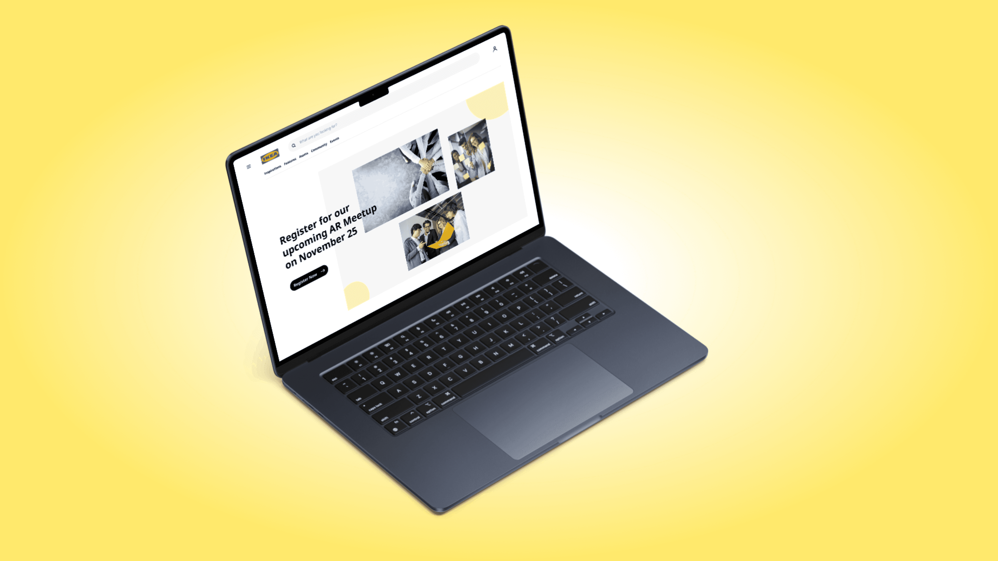
With many new apps like IKEA Meetings, IKEA Spaces, and IKEA AR Shopping in development, IKEA planned to open these to global developers, necessitating a revamp of the portal.
As a member of the design team, I was tasked with exploring various visual directions and designing the portal while maintaining IKEA's brand identity.
Key Highlights of the Portal
Digital Hub
IKEA Developer Portal is the digital hub for information about IKEA APIs and reusable digital components.Contribute
It will allow IKEA co-workers and external developers to actively contribute to global initiatives and conceptualization.Work Together Globally
It will enable IKEA entities, partners, professionals, and individuals to work together and develop digital solutions.
Problems with Current Design
The portal design was not consistent with IKEA's Skapa design system.
Sections were not clearly separated, making it hard for users to discover relevant information.
No documentation existed for IKEA's newly released apps.
Design Process
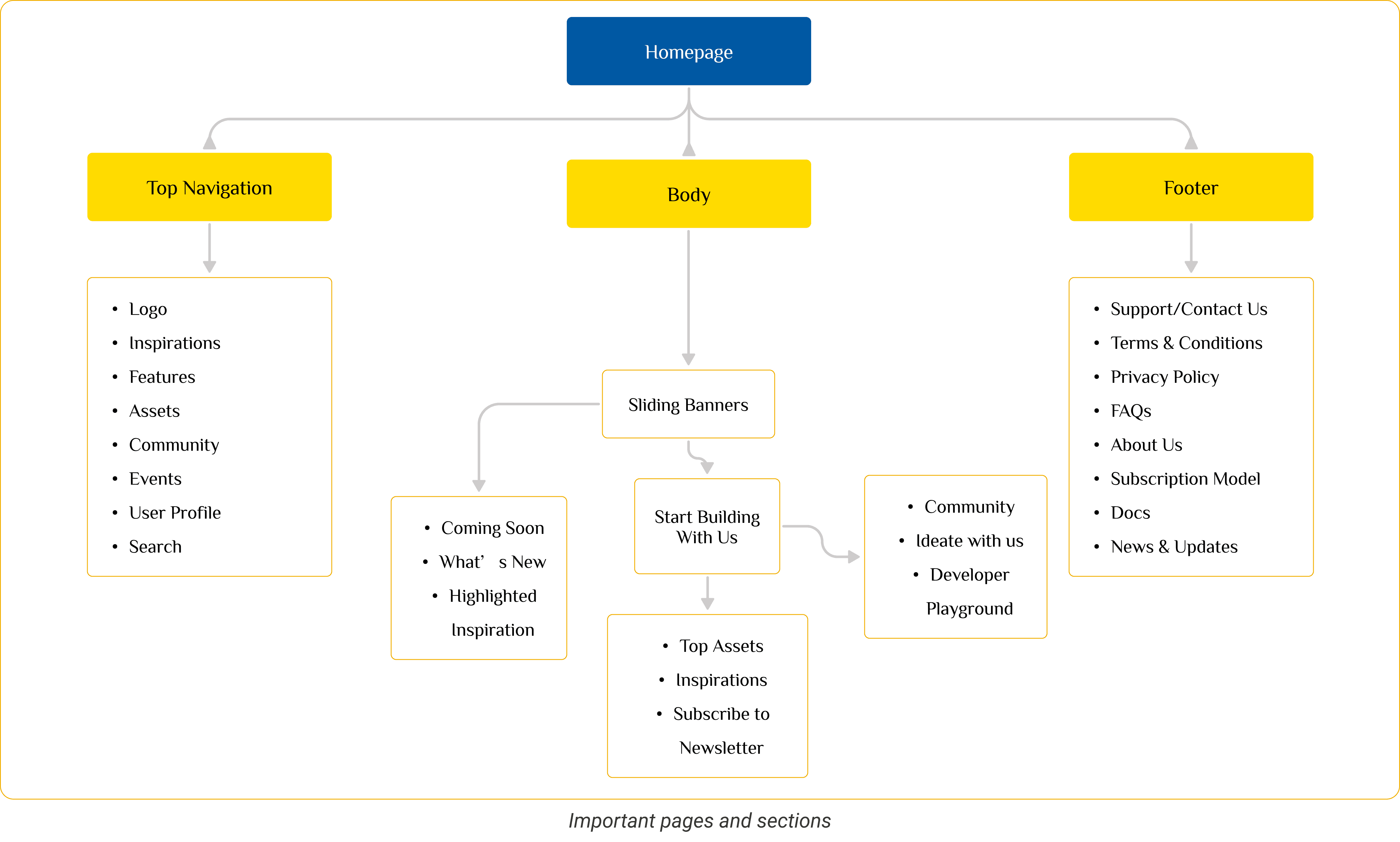
Userflow
We created an initial draft of the userflow to understand the number of screens and entire structure of the website.
Wireframes
I started with sketching ideas on paper and then transforming to medium fidelity prototypes in Figma
Visual Design
After gathering stakeholder feedback, I worked on the visual design, using the Skapa design system to maintain IKEA's brand identity.
Skapa is IKEA’s digital ecosystem that helps employees design, develop, and ship better digital products.
Iterate & Improve
The final designs were tested on internal employees, and based on their feedback, we iterated and improved the overall design.
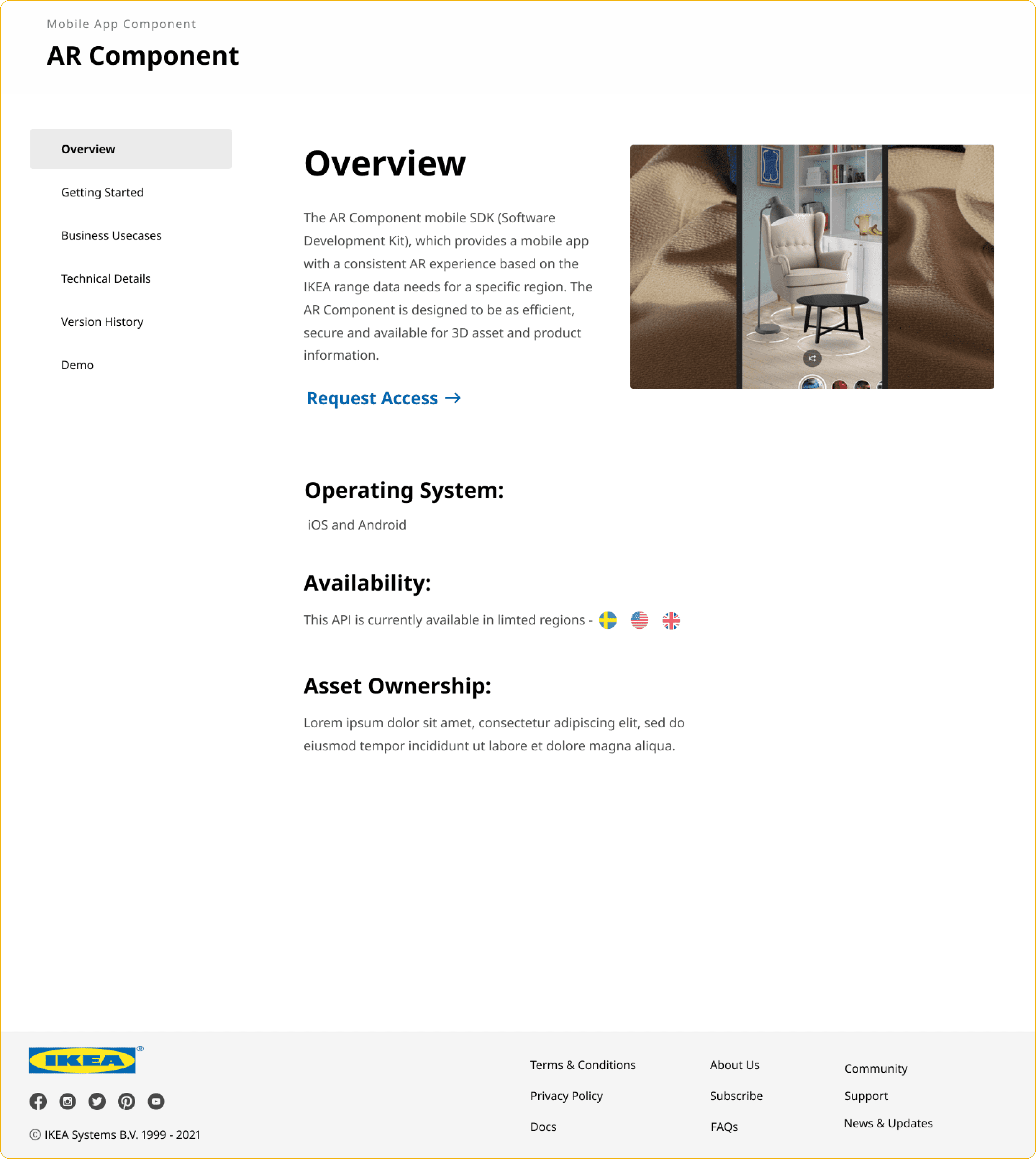
Below are some screens from the final designs of the developer portal:


