Redesigned how users efficiently access, understand, and download
detailed reports of their backup activities.
UX Design
SaaS
Reporting
I know PPDM might sound unfamiliar and hard to understand, so let's start by understanding what it is.
What is PPDM?
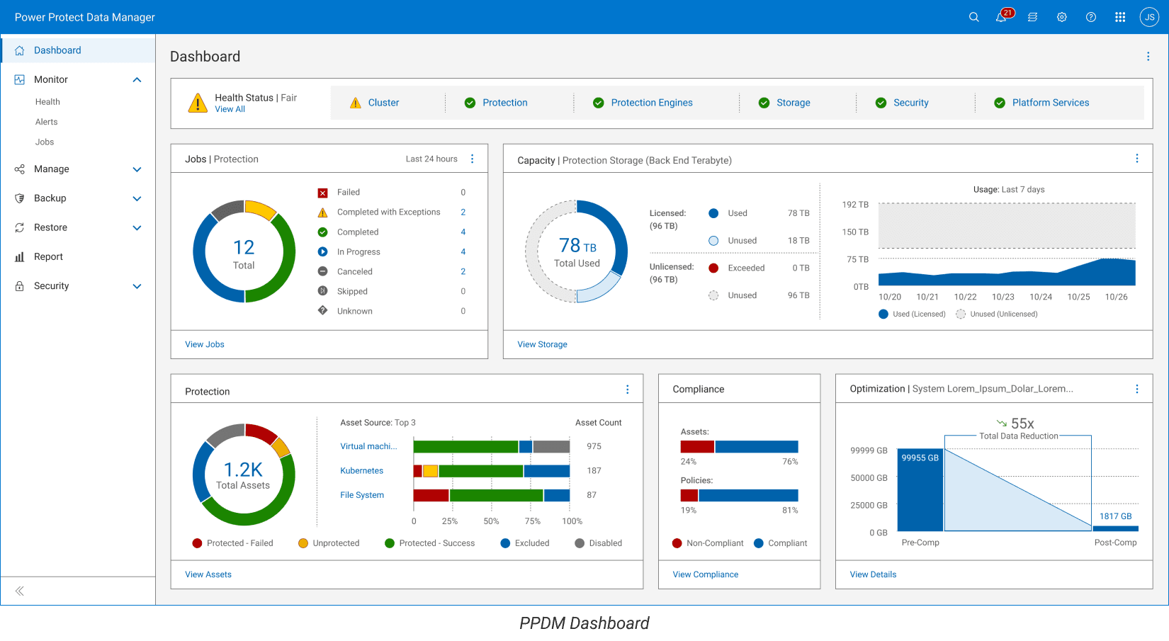
Dell PPDM (PowerProtect Data Manager) is a data protection software that helps organizations secure, manage, and restore their critical data.
Why do people use it?
It allows businesses to protect their digital assets by offering backup and recovery services across physical, virtual, and cloud environments.
What is Dell Reporting?
Dell Reporting is a feature in PPDM that allows users to generate and download reports on backup activity, providing insights into their data protection landscape.

After reviewing the overall stats of the PPDM system, we noticed that while the product team spent a lot of time on the reporting feature, our clients were not using it much.
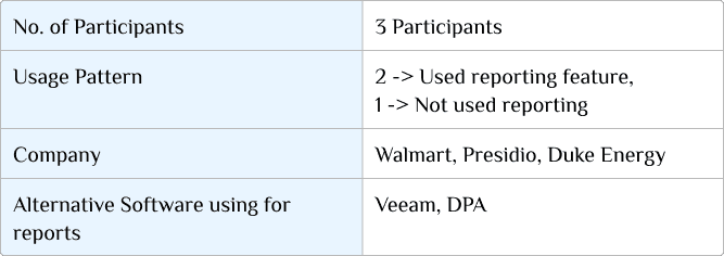
To understand why, we started speaking with clients. These are the types of people we interviewed:
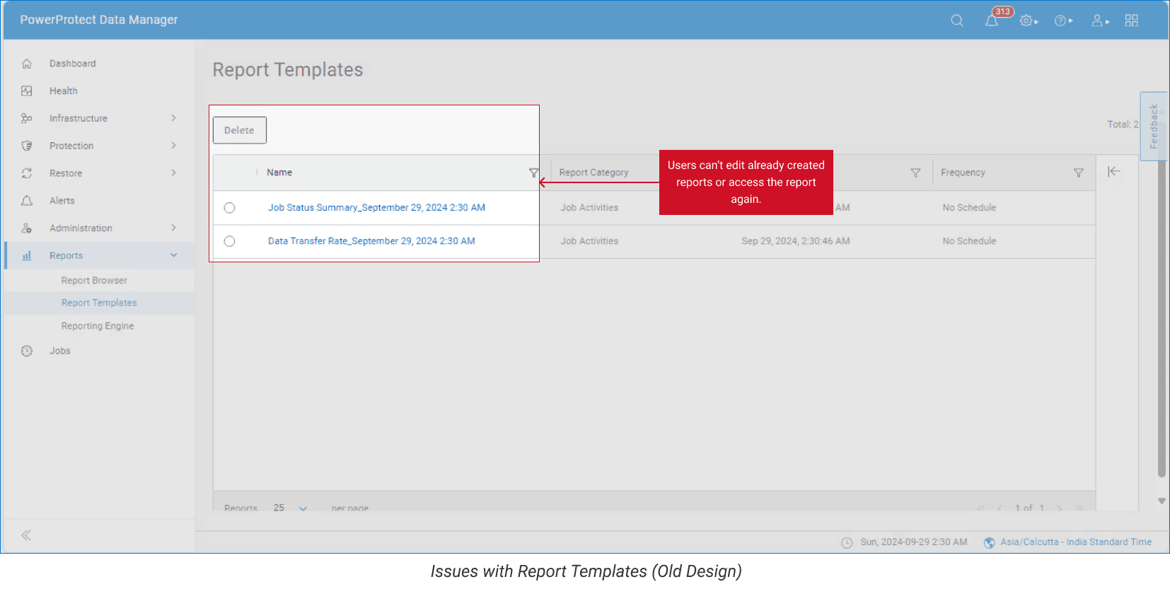
By talking to them, we identified the main problems they had with using our reporting feature. (See fig)
Key takeaways were:
1. Complicated Process & Navigation:
- The steps to generate and reuse reports were too complicated.
- Confusing and unclear terms were used in the reporting feature.
2. No Report Preview:
- Users wanted to see how their reports would look before generating them, but this wasn’t possible. They had to create the report first, which took too much time.
3. Limited Templates:
- There were very few pre-made templates available.
- Users often had to combine multiple templates to get the report they wanted.
4. No CSV Download:
- Users needed CSV format for analyzing data, but this option was missing in that design.
We came up with "How Might We" (HMW) questions to better align the feature with our
users' needs & goals.
Re-design Process
Sketching Ideas
We started by sketching different ideas, keeping the structure of the reporting features the same but updating the interactivity.
While exploring several options, we also had to consider a few technical constraints to ensure the designs were feasible.
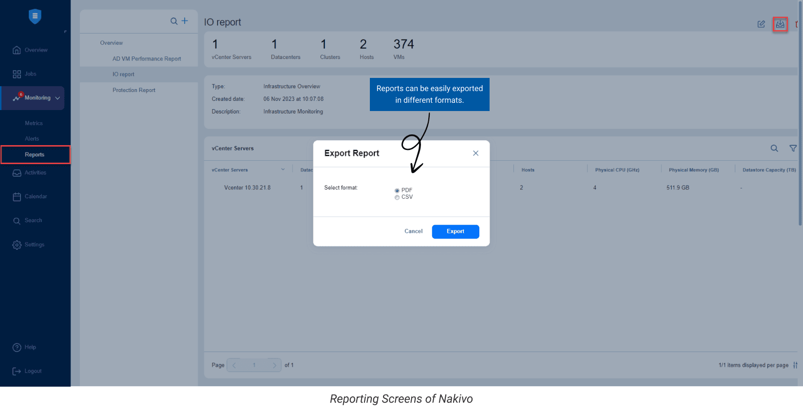
We reviewed the reporting features of platforms like Veeam DPA and Nakivo to understand how they approached their designs.
Few features we liked and considered adding to our own designs were:
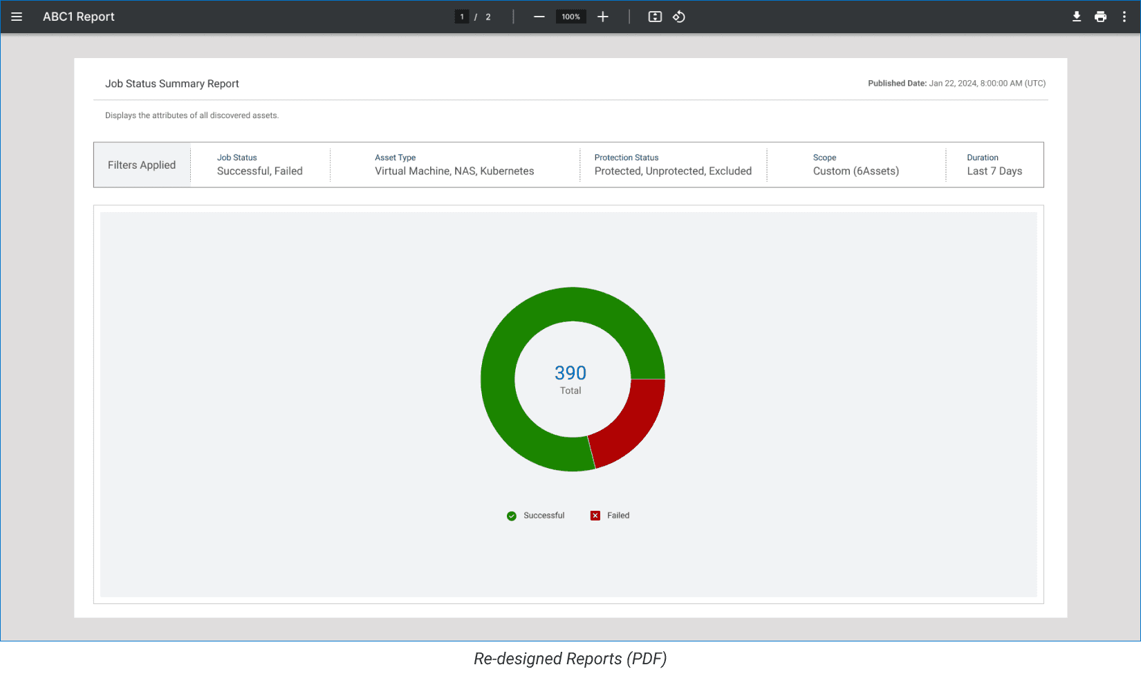
PDF reports include both graphical and textual data.
Reports can be easily exported in various formats.
First Draft & Feedback
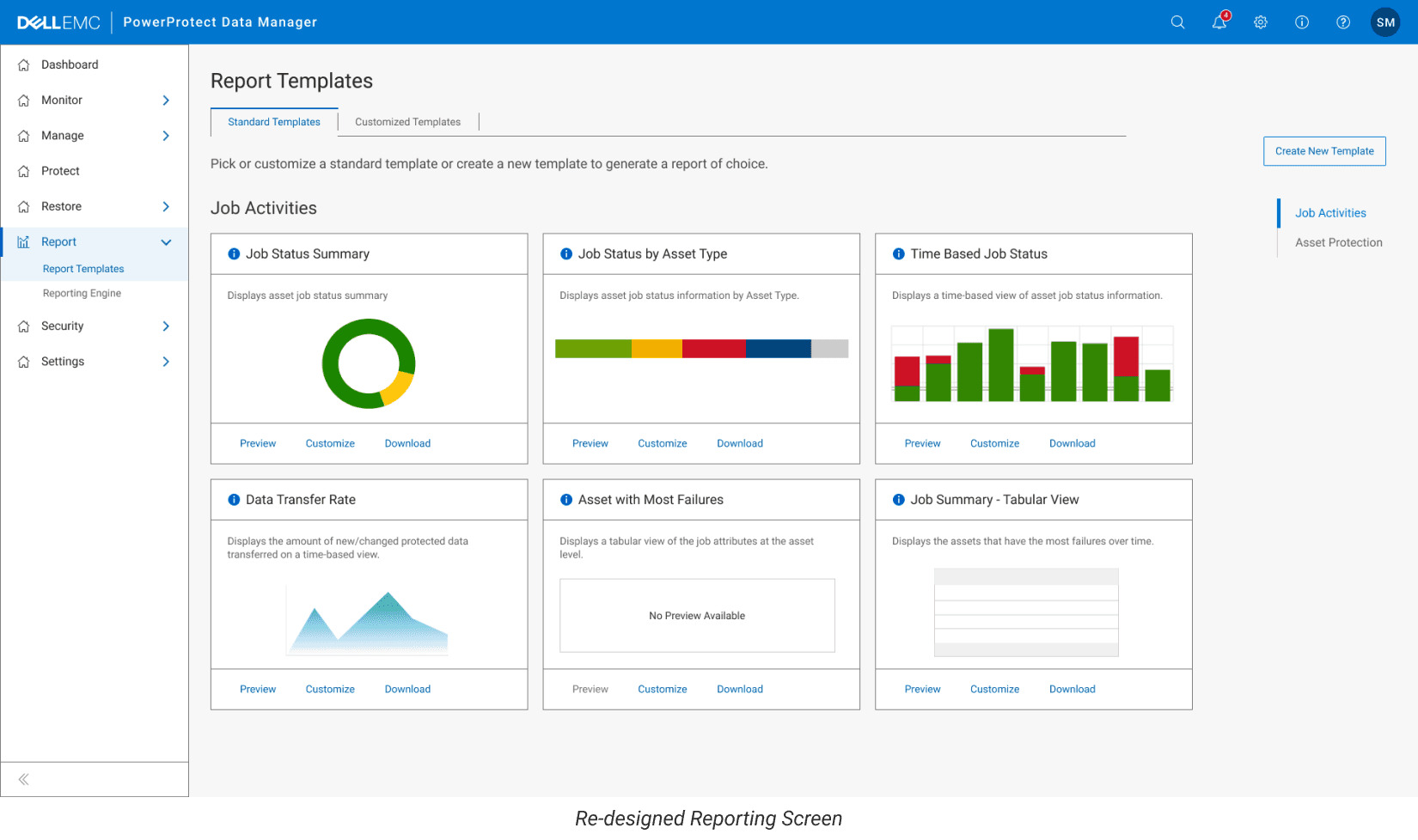
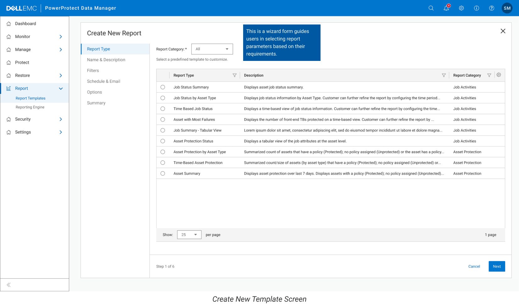
Using the IDS Design System, we created our first set of screens. (See fig below)
We conducted an internal user testing session with client-facing team members to gather feedback on what should be added or removed from the reporting feature.
Key feedback we got that:
1. Pre-defined reports lacked enough detailed information.
2. Generated reports weren’t easy to read due to unclear data presentation.
Iterate, Iterate & Iterate
Based on the feedback we received, we went through multiple rounds of iteration to refine the design.
4 main flows and features we focused on:
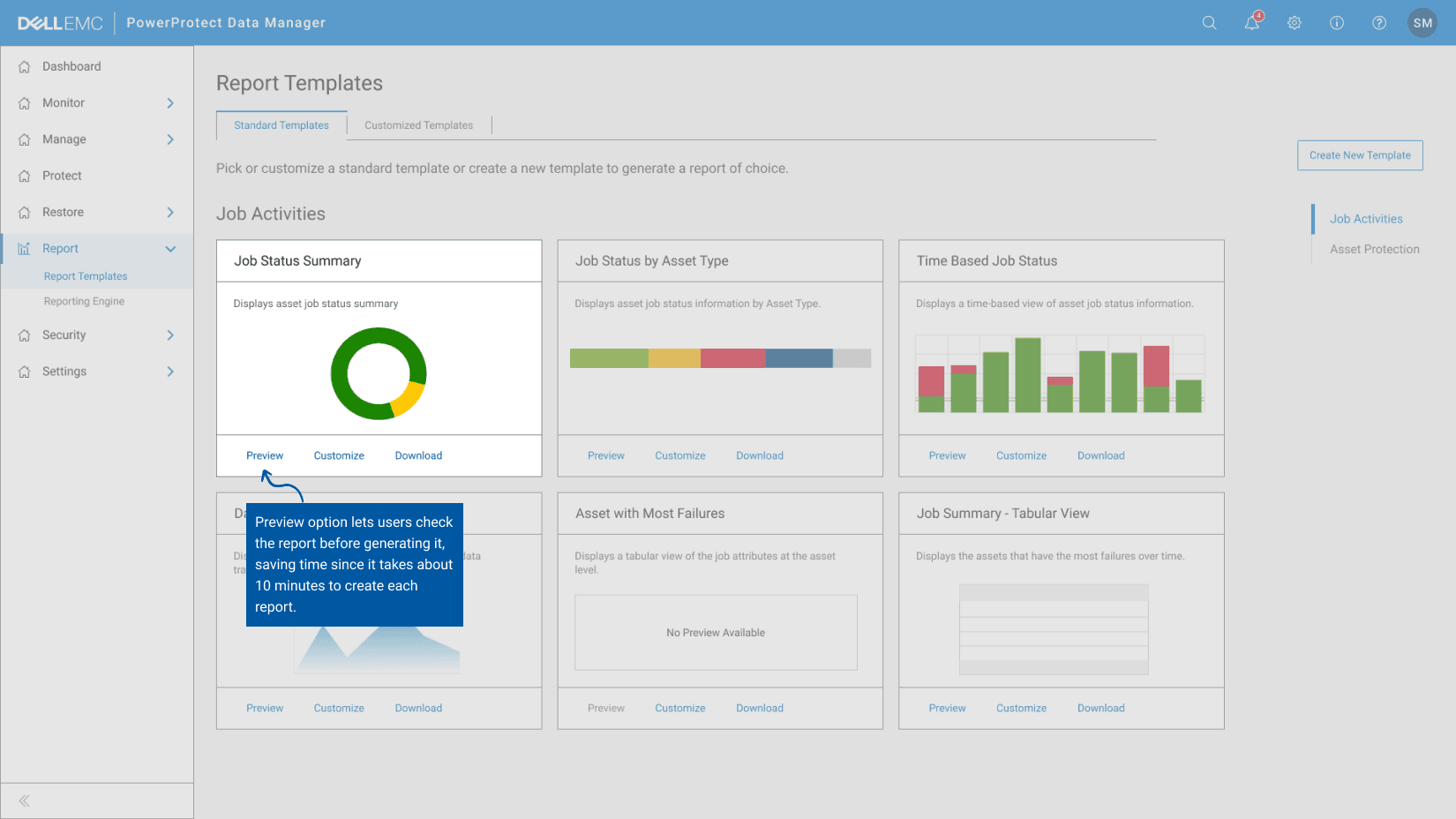
Report Preview
It helps users see how their report will look before generating it.
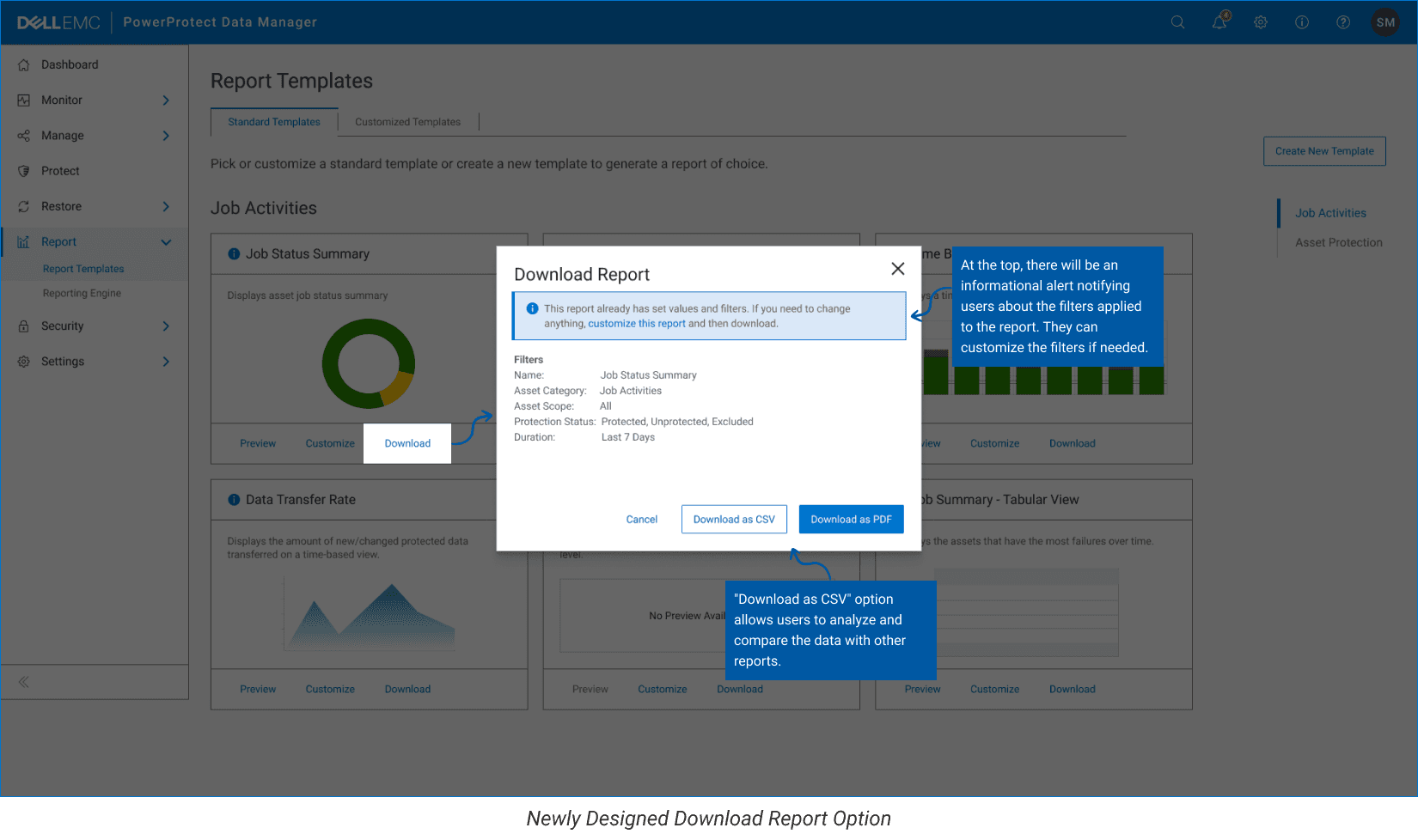
b. Report Download:
Simplify the process of downloading reports in various formats, including CSV.
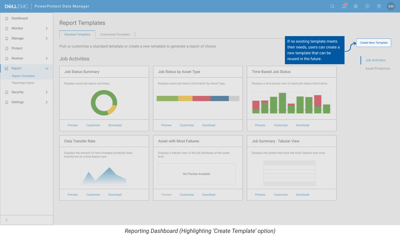
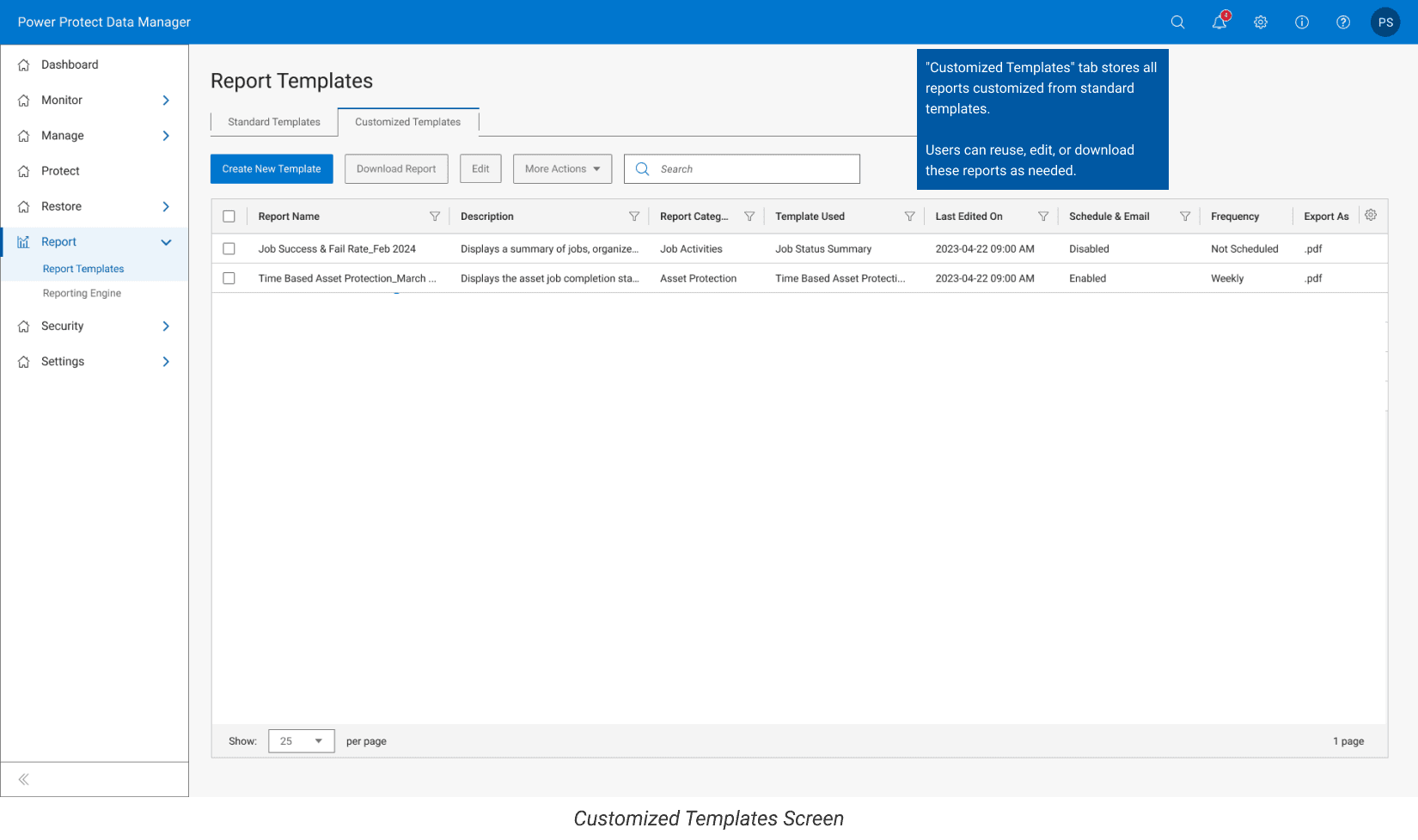
c. Template Creation:
Give users the ability to create new report templates.
d. Report Customization:
Allow users to easily edit already created reports to fit their needs.
Limited Creativity due to IDS Design System
We had to follow the IDS Design System, which kept our designs consistent but limited our creativity. We couldn’t try out more innovative or custom design ideas.
If we weren’t restricted by IDS, we could have explored more dynamic layouts, interactive features, and personalized design styles to better meet user needs.
Limited Access to Customer Data
We also struggled to get enough feedback from customers.
Many clients were not open to discussing their experiences with the reporting feature, which made it harder for us to fully understand their issues.
Final Thoughts
By redesigning the Dell PPDM Reporting feature, we significantly improved user engagement and made the feature much easier to use.
Post-launch feedback showed a noticeable increase in customer satisfaction, and many users appreciated the changes.
As a result, 20% of clients switched to using PPDM’s reporting feature after we walked them through the redesign and they tried it for a few weeks. This marked a strong improvement in adoption and overall usage.


